
Design and Presentation of Meaningful Data in Urban Management Systems
6 May 2021 by Roselia Ruiz
For years, cities buckled under traffic congestion, waste mismanagement, inefficient street lighting, and poorly planned public works maintenance. Air quality went unmeasured, and the valuable data cities generated every day went largely ignored.
Those unmet needs sparked a growing awareness of environmental stewardship and smarter urban planning — one that now brings governments and citizens to the same table.
Smart cities offer a practical response to many of those needs. They are built on the principle of sustainable urban development, applying information technology and innovation to the way cities are governed and managed.
The technological backbone of a smart city is a platform — software and hardware working together — that enables data exchange across different systems and domains: lighting control, waste management, mobility, environmental monitoring, security, and more. This creates a centralized hub for operating and managing the city as a whole.
Increasingly, smart cities are layering in technologies such as sensor networks, IoT, algorithms, big data, artificial intelligence, and blockchain within their integrated management systems.
Integrated Management Systems and Design
An integrated management system is a single platform designed to manage multiple subsystems of a city or building simultaneously. SCADA systems (Supervisory Control and Data Acquisition) are a prime example: they provide real-time remote access to process data, using the appropriate communication tools and hardware to configure, monitor, and control operations.
Integrated management systems gain much of their power from user experience design — the discipline that shapes how actionable information is presented visually.
Design itself resists a single definition. The word refers both to an outcome and to an activity.
The outcome of a design project shows up in the products, services, interiors, buildings, and software processes people encounter every day. But managing those projects is only one dimension of design. The act of designing is fundamentally a user-centered, problem-solving process.
 Urban management systems: centralized real-time data visualization.
At a broader level, we are witnessing a shift from an industrial economy to a knowledge economy — from production-based processes to information-based ones, and from national trade agreements to the competitive pressures posed by emerging economies worldwide.
Within design itself, the discipline has evolved from a primarily aesthetic and stylistic role to a means of improving products, services, processes, and operations. Today, design increasingly underpins social, sustainability, technology, and cultural initiatives.
How design is understood and applied varies enormously — across business, engineering, technology, and the creative disciplines — and each context demands its own approach.
The actionable data that integrated management systems surface through real-time monitoring and control — traffic patterns, air quality readings, waste management metrics — is always best presented visually and accessibly, through data visualization and maps.
Maps are especially effective for route tracking and asset inventory across a city. This optimizes resources for public agencies and sharpens the speed and accuracy of decision-making — ultimately in service of the citizen.
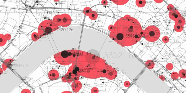
 Geographic visualization of urban data for route and asset tracking.
Data Visualization
Data visualization has centuries of history behind it. Presenting data graphically to aid comprehension dates to the 17th century, but it gained particular prominence during Napoleon's 1812 Russian campaign, when Charles Minard produced a flow map showing the size of the French army and its retreat route, overlaid with variables such as temperature and time.
Data visualization also has deep roots in statistics and is generally considered a branch of descriptive statistics. Because effective visualization requires design skills alongside statistical and computational expertise, some authors argue it is as much an art as a science.
The datavizproject.com catalog is a useful reference for exploring the full range of chart types available for representing data graphically.
Best Practices for Data Visualization
When representing large datasets visually, a few principles go a long way:
- Match the chart type to the message. Bar charts work well for comparisons; line charts communicate trends; pie charts are a poor choice when differences between segments are small.
- Don't truncate axes. Cutting off the Y-axis distorts the apparent magnitude of differences and invites misinterpretation.
- Use color purposefully. Only use colors that carry meaning — too many colors create noise rather than clarity.
- Keep charts clean. Like color, visual clutter degrades comprehension. Remove any element that doesn't serve the data.
- Label everything. Every data series, axis, and notable point should be identified.
Some experts claim that data is the new oil. The analogy holds in at least one sense: in an increasingly digitized world, nearly everything can be measured and interpreted — and that raw material is only as valuable as what you do with it.
Sir George Cox, Chairman of the Design Council, put it well:
"Many countries are beginning to face the challenge of an increasingly competitive world. Any technology that does not produce better systems or products will be a wasted opportunity, and any company that is not sufficiently creative will be devoting its energies to prolonging the ideas of the past. Creativity correctly applied, rigorously evaluated, skillfully managed, and intelligently implemented is the key to a company's success and a country's prosperity." — Sir George Cox, Design Council
Roselia Ruiz rruiz@innotica.net LinkedIn
References
- What Is Data Visualization and Why Does It Matter
- Smart Cities
- Urbo: Smart City Telefónica
- Integrated Management Systems – NQA
- Data Visualization – Wikipedia
- Best, Kathryn. Design Management, 2nd ed. 2009.